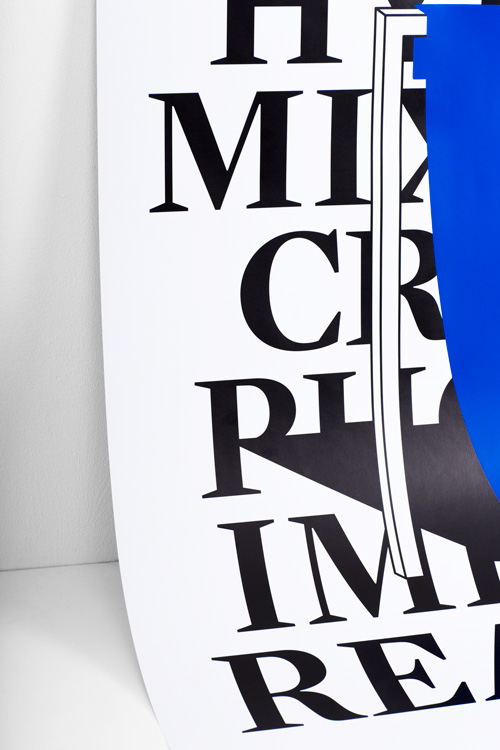
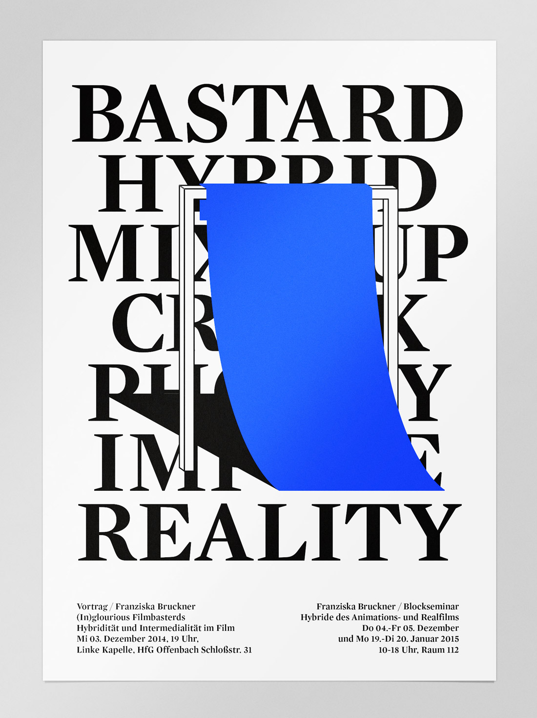
We were invited to design a poster for a talk and seminar about Hybrids in and of Films at the University of Art and Design Offenbach.
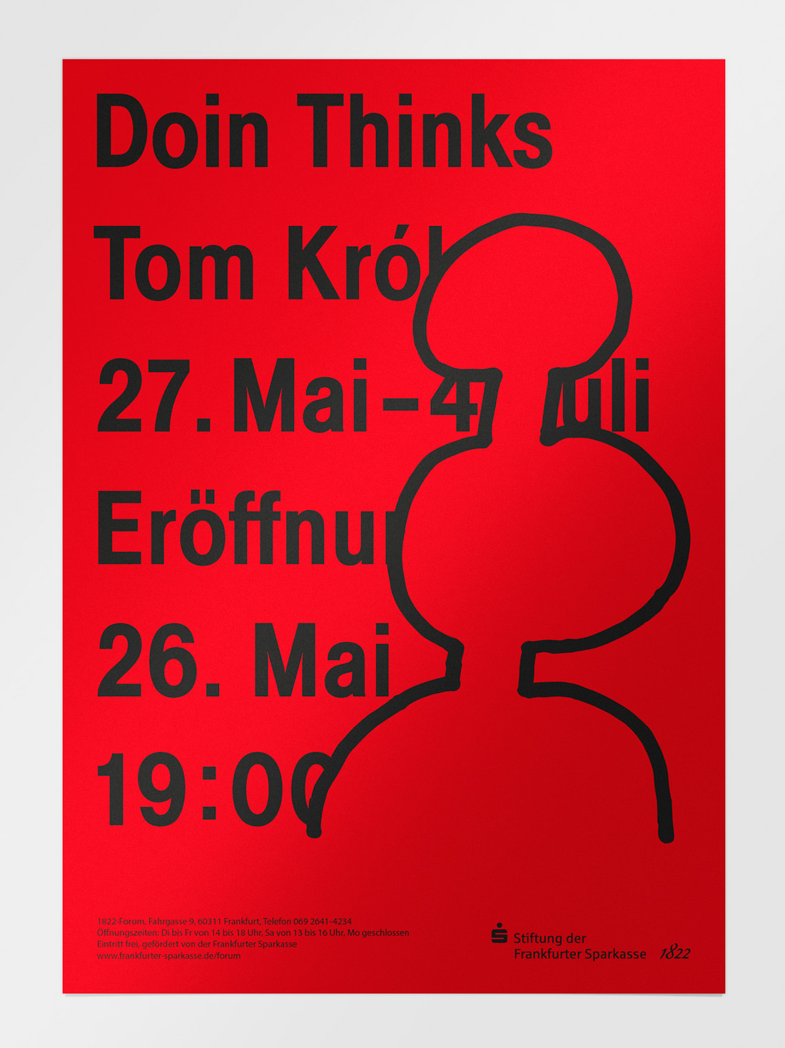
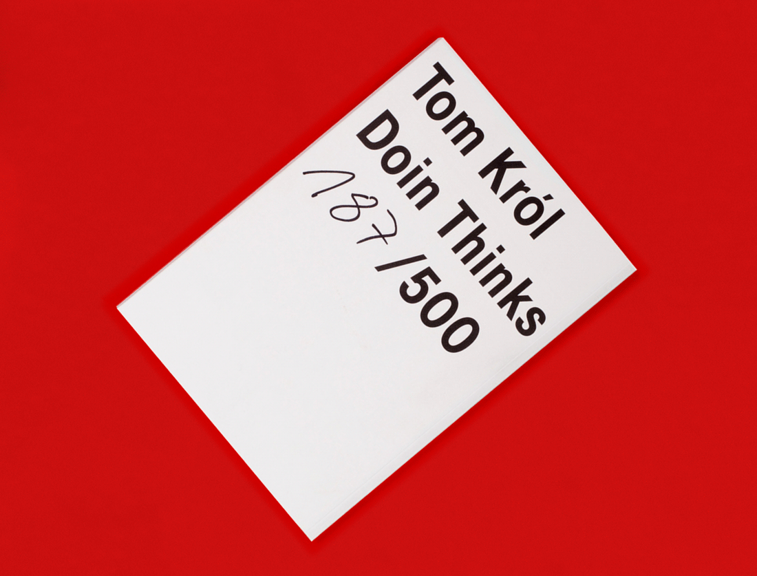
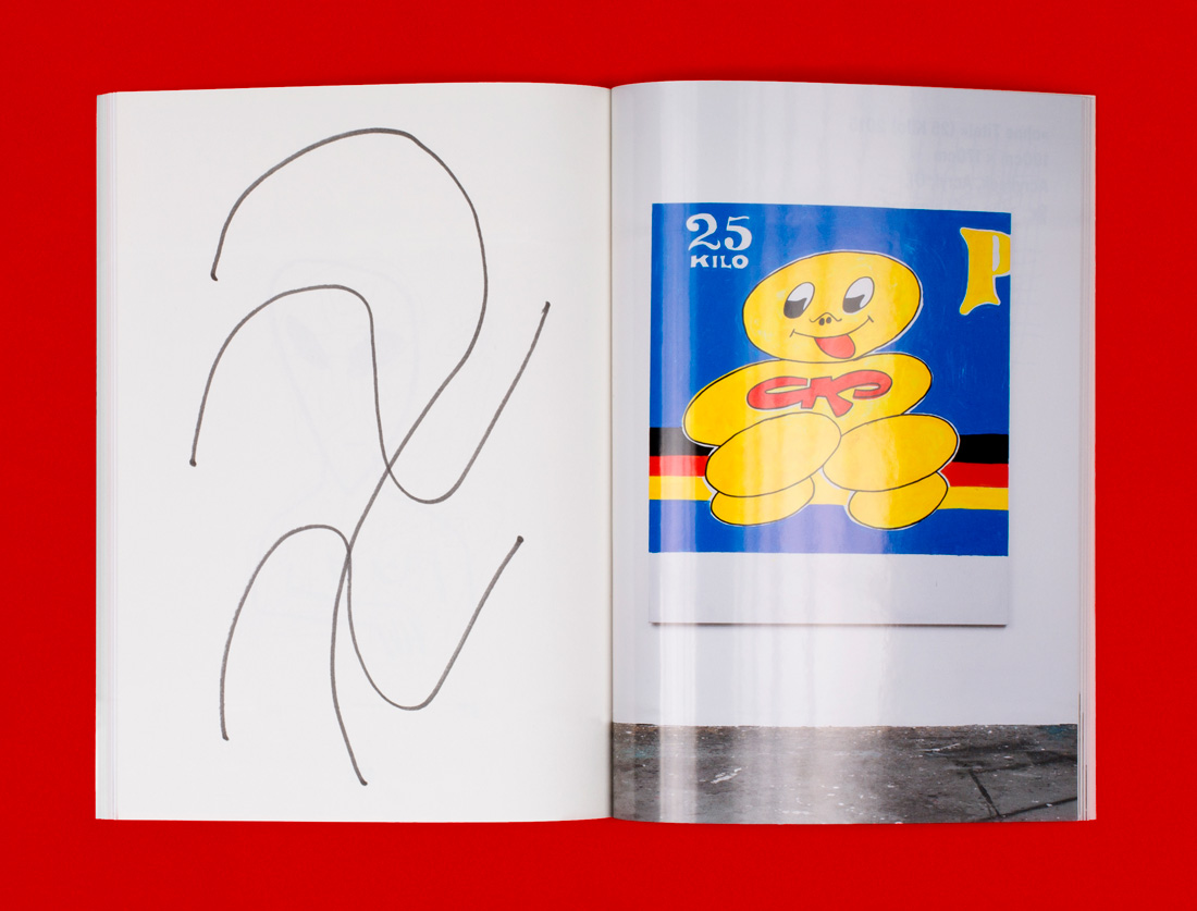
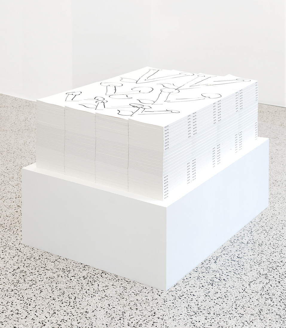
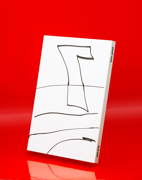
»Doin Thinks« is the first solo show of the upcoming artist Tom Król. Besides the exhibition poster and invitations, we created a catalogue featuring his collected work from the past 3 years. As we worked directly with the artist, we had Tom Król draw on a stack of 500 books in layers of 4 by 4. At the Opening of the show the motif on the top layer recomposed as visitors began to take away the books. The edition is limited to 500 copies.
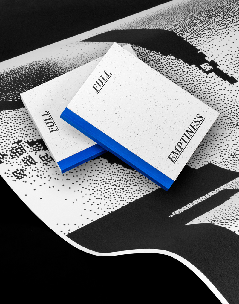
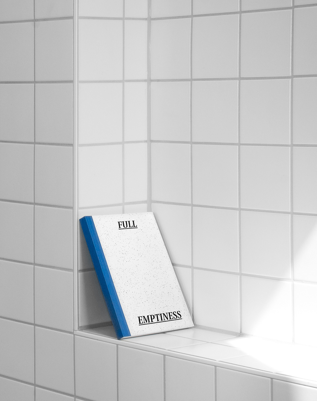
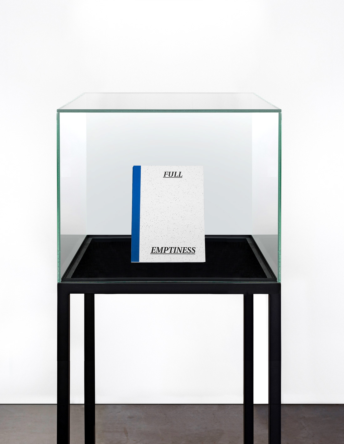
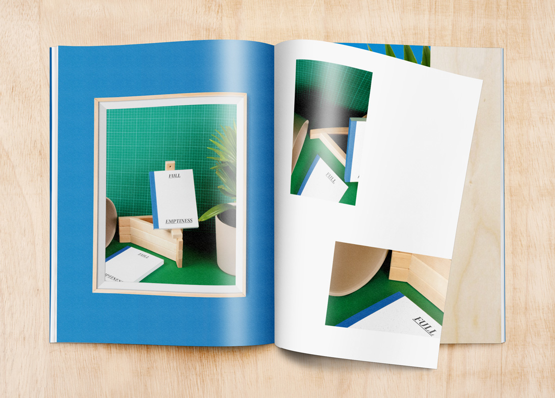
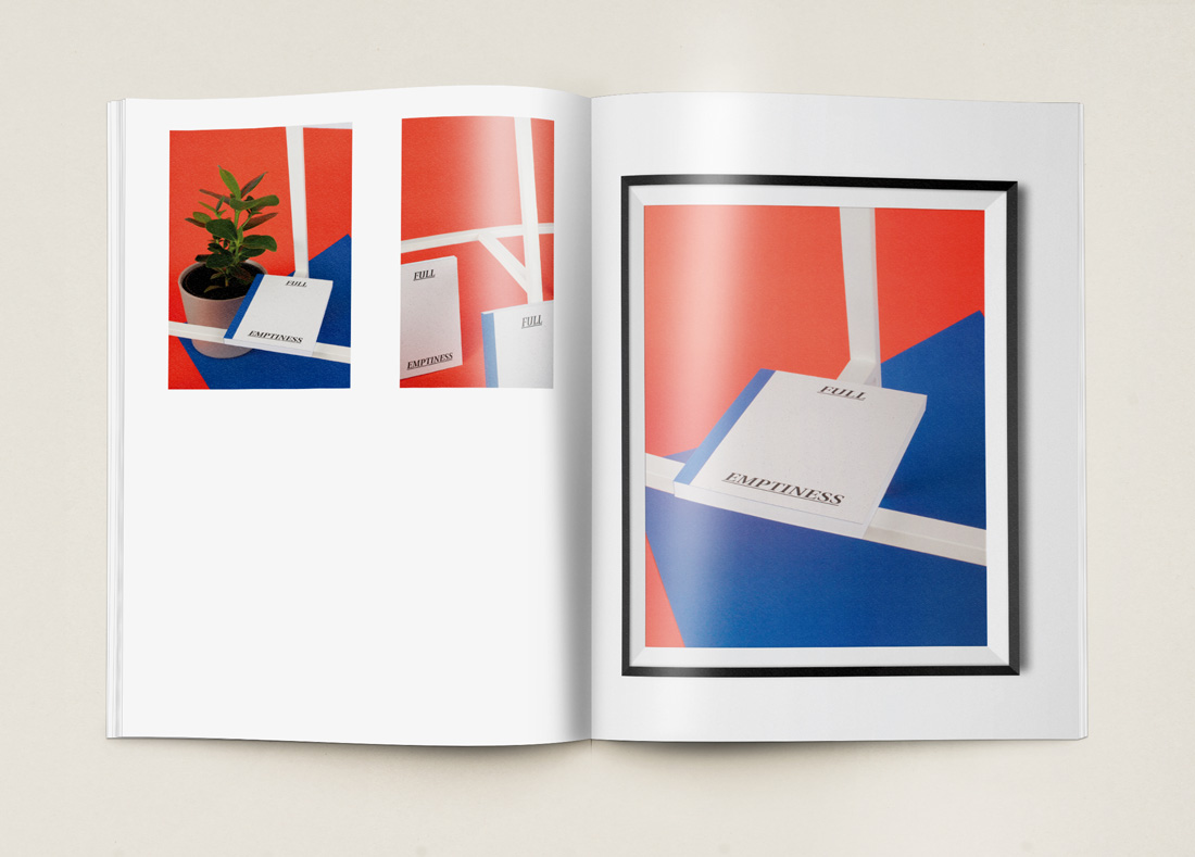
Full Emptiness is a research project on presentation asthetics in the internet. The photographed book is interchangeable. There could as well be a different project against the background. Only through depicting the exterior views as content of the book, the question is whether the external representation has enough relevance to generate content. Our sample can neither be touched nor skipped, because it is shielded by the showcase. Trough this it is similar to the method of presentation of projects in the internet. Feel, content and function are taken from it. Whether something is actually located on the inner sides remains uncertain.
The diversity of the Internet requires a prior filtering of information. This can particularly be seen on platforms such as graphic design blogs. These usually only allow a limited insight into projects, since images are presented in a new context, regardless of their origin. Despite this, they are the main stage for portfolios and works. Through the visual culture of the Internet, the work of the designer gets reduced to a single graphic element. In this new environment an exceptional staging is necessary to stand out from the mass of images. The selected image becomes the showcase for the skills of the designer, with which he can show his aesthetic understanding and craftsmanship. The staging is therefore just as important as the actually designed project. This parallel design has several functions:
The environment shown should enhance the project without revealing any further information about the content to the viewer
The arrangement of different materials gives a value to the project. These materials often have a certain meaning or haptic association, which the designers use. By choosing a presentation form the designer is in full control of all aesthetic and content wise decisions.
Thereby whole documentation chains are often shown, which should give the project authenticity and reality. Whether the project has actually been produced or not can not be discovered at a first glance. The point is to create the illusion of a product reality.
The documentation often shows possible effects on reality before they even happen. For example this can be seen in supposed exhibition situations, human interactions, devised by-products or sales situations. The actual content of the projects is often less clear or remains completely unknown. The question of content will be pushed aside by the visual culture on the Internet. So the advertised project becomes the occasion of a new design, while the content plays a marginal role. The project becomes a graphical object in a visual collage.
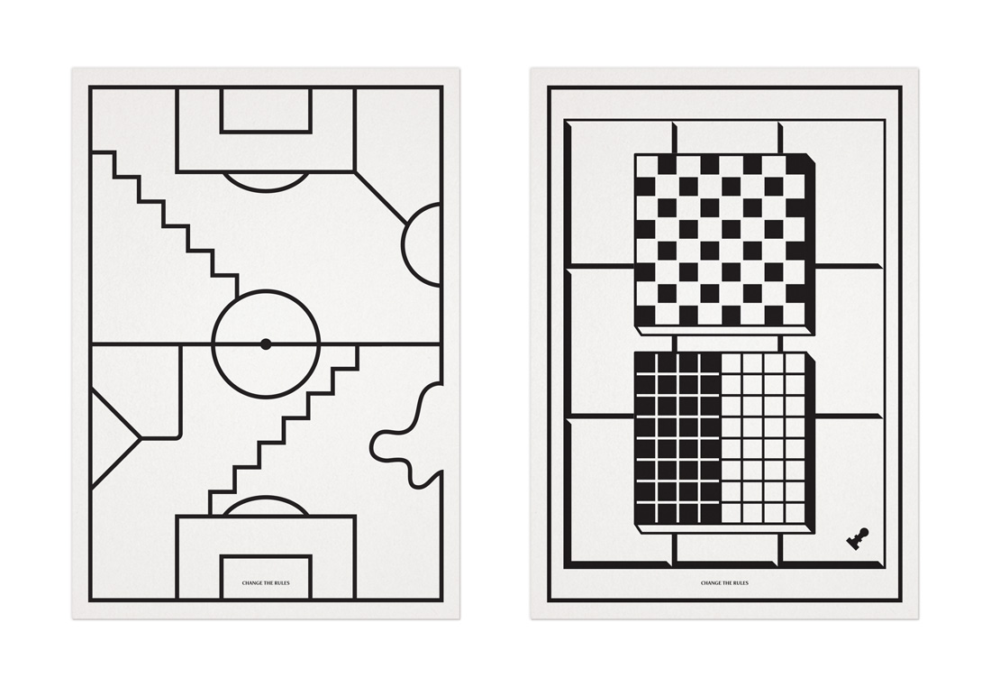
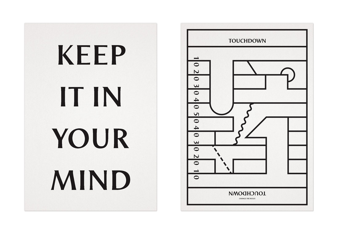
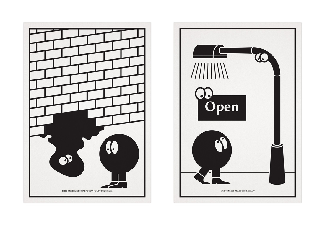
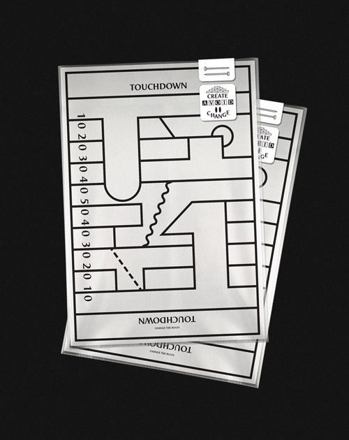
Create, Avoid, Change is a series of risographed Din A4 sheets on design topics such as influence, work rules and visual language. They whole package was sold at the
New York Art Book Fair.
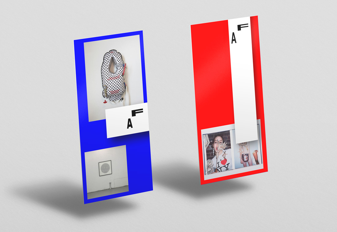
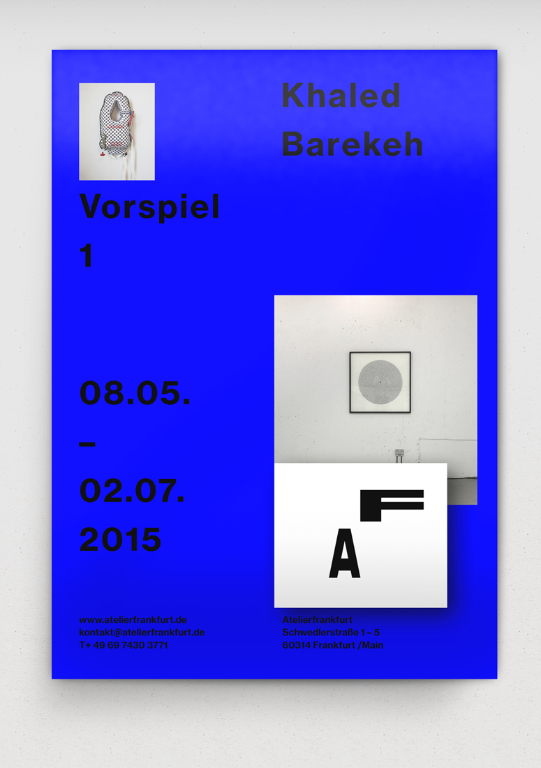
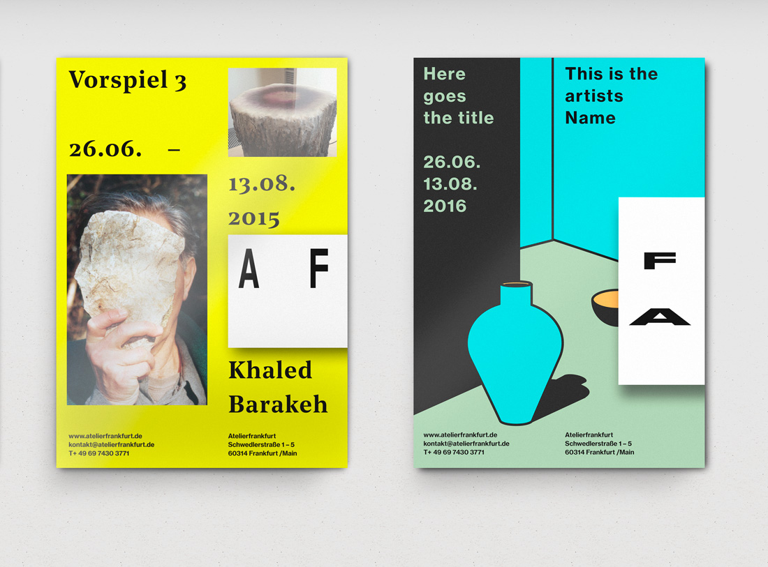
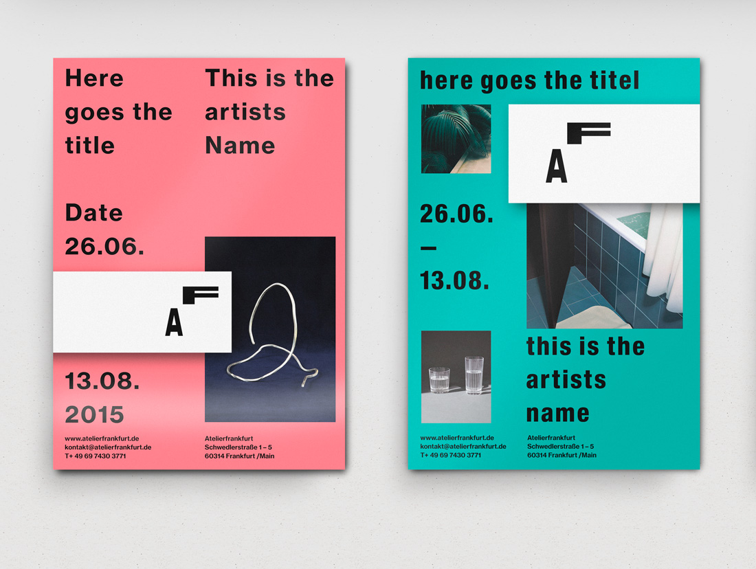
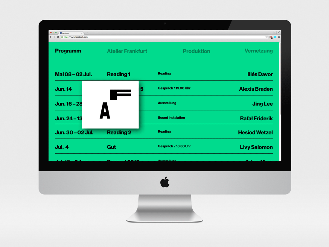
Atelier Frankfurt is one of the biggest associations providing artist-studios in Germany. We created a new identity concept for them. The logo we designed is intended to interfere and overlap with Information and images. At the same time it ties everything together. The idea was to provide a grid that would allow the client to represent all of their events, such as exhibitions, readings and lectures in different ways. The possibility of changing typefaces and logo positions assures a good variety and an easy way to keep everything up to date aesthetically. Unfortunately, the client has decided in favor of someone else.
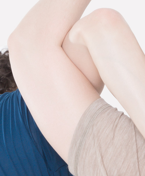
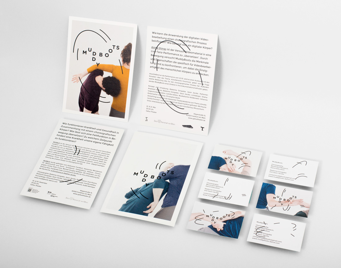
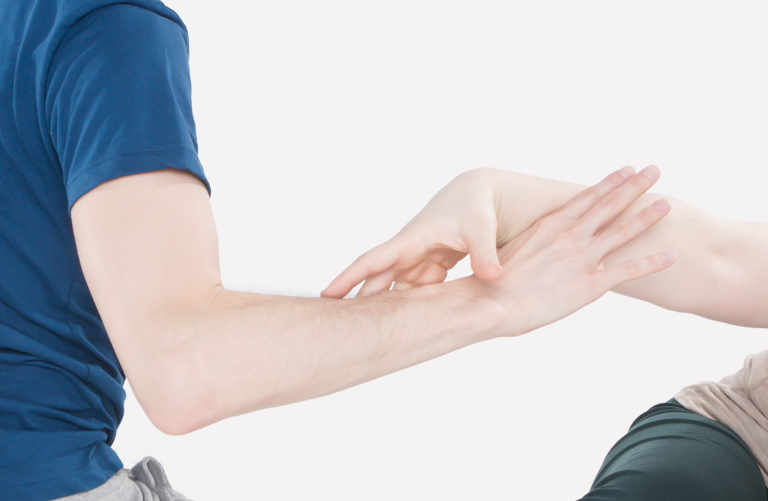
Muddy Boots is a collaboration between the dancers Ekaterine Giorgadze and Jason Jacobs. Their new look is based on movement patterns inspired by their dance. Muddy Boots dance is based on material textures, writing, current events and more. Our graphic patterns act as another transformation from object over dance to patterns and back to movement. When the patterns overlap the photos the motion becomes visible again.
Art direction: Wedo-Studio
Photographer:
Evelin Dragan
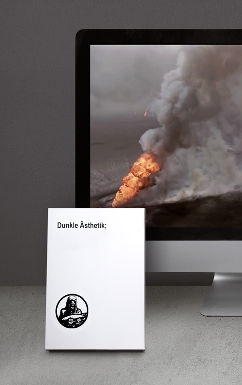
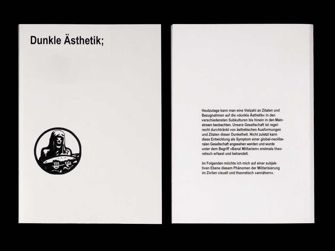
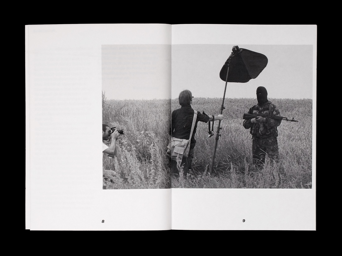
Dunkle Ästhetik
»Dunkle Ästhetik« (Transl.: Dark Aesthetic) is a visual and theoretical approach on the normalisation of military aesthetics in everyday life and the civil society. The short video is used to visually underline the topic. None of the material is owned by us nor does it reflect our opinions. This is a research project.
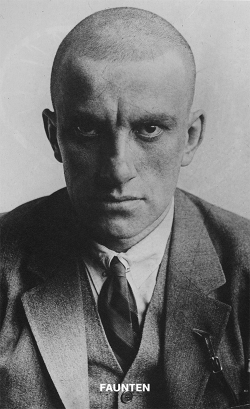
»Faunten« is our own small platform to publish texts and essays on design and related topics. The main reason for this ongoing project is to share views and make ideas accessible. At the moment all the books are only available in German. If you would like to contribute something or get a copy, send a mail.
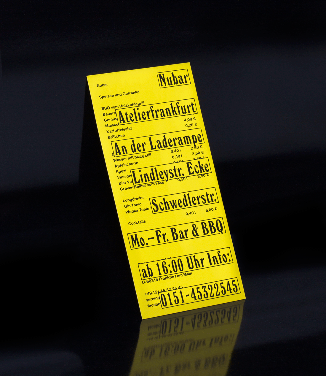
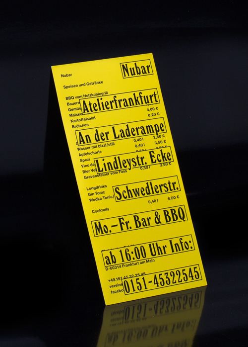
New Printed matter for the Nubar, located in Frankfurts east harbor.